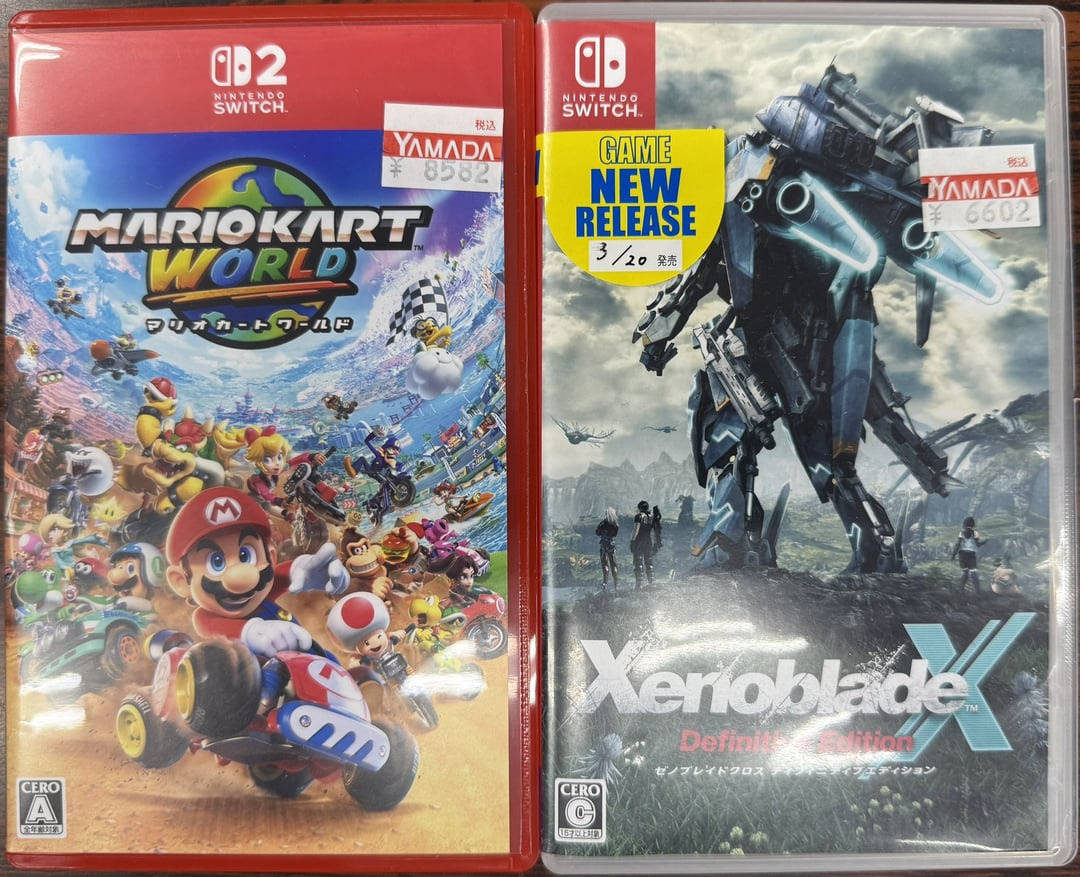
Howdy Goons, a few months ago people were making guesses at what the new Switch 2 game cases would look like. Some outlets got wind that the Switch 2 cases were going to be much bigger. At least vertically and horizontally, but the thickness was projected to be the same.

According to some guesses from the media the Switch 2’s game cases were going to be 13 centimeters wide by 19.5 centimeters tall. For comparison the original Switch cases are 10cm by 16cm tall. This means that the new cases would be close to the same width and slightly taller than a traditional DVD case. That’s a pretty big case for games that are still the same size cartridge. Still, people must not have caught on because those dimensions are absurd. Personally I think Switch cases should be the size of 3DS game cases because there is a lot of negative space in a Switch case. That’s a waste of plastic and shelf space. It turns out that yes, indeed those numbers are absurd because we have some picture proof showing the new cases next to the original Switch.

These are likely the final product as these are from a store and the store will have display cases way before the game’s release. Say hello to your new cases. You already know my thoughts on these cases, the title says “sexy” after all. It makes total and obvious sense that the game cases would continue to be the same size. Considering how many Nintendo Switch games are in print out there and that a new case would mean new molds and having to get them to factories, it’d be more expensive to “switch it up”. The major difference here of course is the red transparent case and it is so purdy. Like I’d ask this case to a dance, mostly because I know dressed in red she’s probably a bad girl and that’s how I roll (dons my sunglasses and fedora). I personally like this design because it really leads into Nintendo’s new direction of being more inclusive of their adult audience. Also I like that we’re moving back to having colorful media again, I’m getting really tired of grey, brown, white, and black.
It’s not all sunshine and rainbow roads though, there are some minor gripes I have with the case design. My biggest issue is with the top border, the Switch 2 logo. It takes up way too much space, the box art looks very cramped. With the dreaded keycards you’ll see a warning box that takes up the bottom inch telling you that the game is just a digital key as a cartridge you’ll be left with even less space on the box for art. This means 1.5 inches taken up by the Switch 2 bar, 2 or more inches for the logo, and another inch or two for keycard warnings, it leaves you with practically no space for anything else. Already this box looks packed, can’t imagine it with another inch less of space. Let’s take a look at the back of the box.

The back of the box is much more spacious. You only have an inch or two taking up the legal jargon zone, and the rest is filled with the stuff we want to see. Unfortunately this isn’t the side you’ll get to see at most retailers. Outside of Gamestop you’ll likely never see the back of the box. Walmart and other stores still seal their games behind glass cases so the sale really hinges on the front of box because there is 0 chance I’ll ask an employee to come over. It’s annoying for both of us. They’ll open the case, I have to admit what game I want to look at, they’ll grab the wrong one and ask again, then hand it to me. Then I have to sit there and look at the box while I have someone who is underpaid staring at me or waiting awkwardly to be allowed to go back to their job they hate. It’s even worse if I have to ask them for a different game.
Yeah, I’m not doing any of that. The back of the box is functionally useless for me but I usually go in knowing what I want already so it’s not a huge issue.

Here we can catch a glimpse at the spine of the game. I prefer the full red label of the Switch Classic that shows the title and the publisher on the bottom of the spine. It makes reading the spines and finding your games quicker and honestly seeing 1/100 of the box art doesn’t do much to excite me to play. So this art on the side is pointless and doesn’t contribute to the interest of the game. Since the spine doesn’t sell games you may as well keep it minimalist. I really don’t like the black box for the ratings zone. But this is really all I had to say on the case. The red case to me invokes a sort of adultness to them, it brings to mind images of sexy red dresses and red lipstick. Why did Nintendo have to make the cases fuckable?